How to Read a Color Deck
When it comes to how to read a color deck, it can seem overwhelming. You have a deck of hundreds of colors to choose from, and your first reaction is “Where do I even start?”
The first question I ask clients about color is “what theme are you wanting?” Are you wanting a warm and cozy vibe or a cool and refreshing one? Once you know your theme, then it is easy to narrow down what decision you lean towards.
Recommended Reading:

The Best Brown Paint Colors for Home Exteriors
The Best Brown Paint Colors for Home Exteriors Recommended reading: FRENCH ROAST SW 6069 French Roast is without a bout one of the…

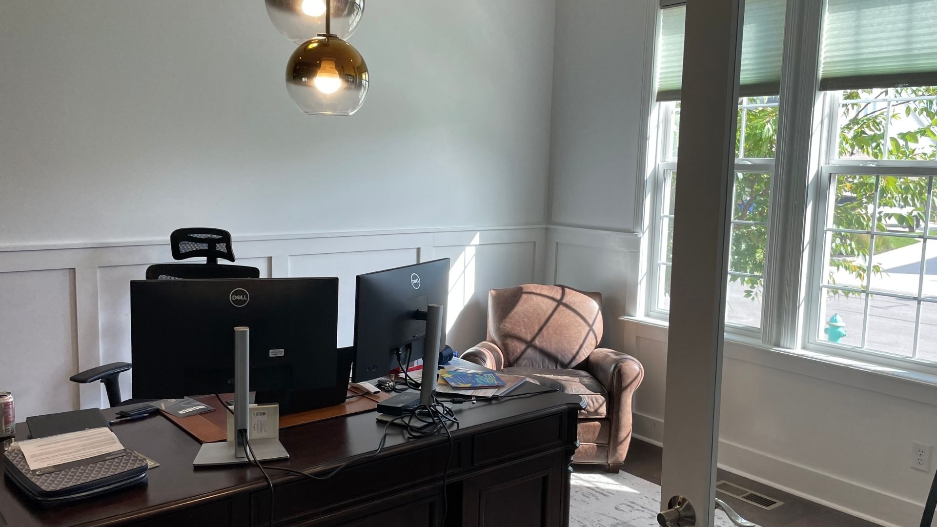
Home Office Paint Ideas
Home Office Paint Ideas Remote and hybrid work is the new normal for many workers, and as such many people now…
How to Incorporate Trending Interior Black Paint Ideas
How to Incorporate Trending Interior Black Paint Ideas Color trends come and go every year, but there are some colors that…

The Best Exterior Colors For Homes
The Best Exterior Colors For Homes Choosing the right color for your home exterior can be stressful. You want to give…

Color Consultation Appointments and Why They Matter
Color Consultation Appointments and Why They Matter This post originally appeared in the Indy Real Producers magazine. When clients accept their projects with Heritage,…
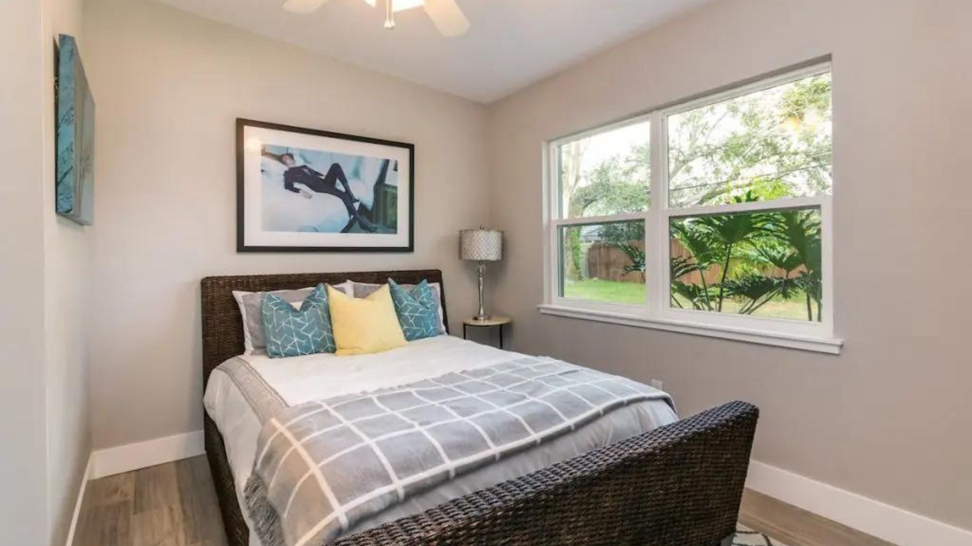
The Best Colors For Bedrooms (And The Worst)
The Best Colors For Bedrooms (And The Worst) There are so many options to choose from when selecting paint colors for…
COLOR IS COMPLEX
That’s when I ask if they want a cool white or a warm white. Same with grays, there isn’t just one gray. There are also cool grays and warm grays. If you are looking for a neutral gray though, there will be a strip that strictly just goes from light to dark gray. “Greige” is also quickly replacing standard beige. A greige is a grey color with tan undertones. Which leads us to the next section.
When I ask clients what they have in mind, some responses I get are “some type of white” or “some type of gray.” That might seem like a definite answer, but in the color world, white doesn’t always mean just white, and gray doesn’t always mean just gray.
UNDERSTANDING UNDERTONES
Warm colors are your oranges, reds, and yellows. Cool colors are blues, greens, and purples. The same goes with neutrals as well. Whites, blacks, and grays can either be warm or cool. If you want a warm and cozy vibe, than find a tan, white, or gray with warm-colored undertones.
Undertones are the subtle secondary colors that shift a color toward warm or cool. If you look at a color switch with several white options, they will all vary slightly. That is because of the undertone.
For cool refreshing vibes, find a tan, white, or gray with cool-colored undertones. Strong undertones are good to have, especially when if you want a neutral palette but like some color. You might want a shade of gray, but finding one with a slight blue undertone could compliment the blue accent colors that you have in the surrounding space.
HOW TO READ A COLOR DECK
As for navigating the strips in the color deck (which you can find in hardware stores or online), there are a few best practices to follow.
On any given swatch, look for the middle color. This is the base color, and moving up from here adds more white, and moving down adds more black.
The very top of the swatch is a washed-out white with undertones of the base color. The bottom shows the darkest shade of the base before going totally black.
And even in that case, there isn’t just one black in a color book either. I will say they are a lot harder to distinguish between each in the strips, but if you are holding them under the appropriate lighting, you can tell which undertones they portray.
Once you know which theme you are looking for, narrowing down your selections makes it that much easier. And don’t forget, that lighting will be your biggest hurdle in any color selection battle. If you have yellow-hued lighting, that will reflect yellow undertones into any color you choose. That’s something to consider if you’re choosing an exterior color or have an interior space with lots of natural daylight.
Hopefully, this post makes it clear how to navigate a color deck to make color selection a fun and exciting process. If you need help choosing a color, Heritage Painting provides complimentary color consultations as part of your project. If you’re ready to get your interior or exterior project started, fill out the form below for a free estimate today.
Get a Free Quote From Heritage Painting
Fill out the form below and experience the difference today.